
Ravelry.com launched a new look website on 16 June 2020. The old version had been around FOREVER, so this redesign is a big deal!
UPDATE: You can now revert to the old Ravelry design. Here’s how →.
A fresh design & a better mobile experience
The old Ravelry site had quite a dated look. It was very functional & fast loading, but not the prettiest.
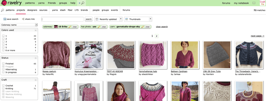
The new look Ravelry is fresh & clean, while also having a retro look. There’s lovely illustrations & icons throughout which add personality & give a friendly, community feel.
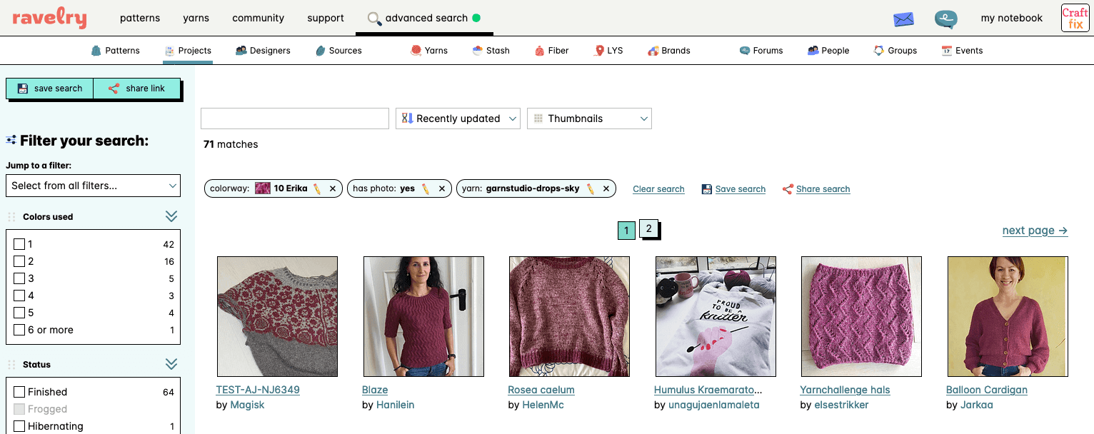
Looks aside, Ravelry is now much easier to use on mobile too which is a big step forward.
Not everybody’s happy
The official Ravelry forum thread to discuss the new look had posts from over 4000 people within 24 hours! Many have been sharing their thoughts on social media too.
Initial feedback has been mixed which is typical for large website redesigns.
We are all creatures of habit. So there’s always an initial shock adjusting to a website you know & love changing, even when it’s an improvement. This is usually short lived & before we know it we only vaguely remember the old design we once clung to!
The old Ravelry design was around a LONG time, and the community is diverse & actively engaged, so it’s natural that people will have different views.
However, I’ve been taken aback by the tone of some of the negative feedback I’ve seen. I’ve seen plain rude comments from people who just hate the new look full stop.
More worryingly, there are growing reports of accessibility issues with certain users saying the new high contrast design hurts their eyes or even triggers migraine.
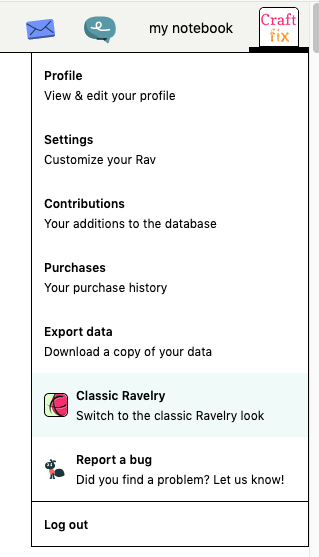
How to switch back to the old Ravelry design
In response to these concerns, Ravelry have made it easy to revert back to the old design.
Just click on your ravatar (profile icon) in the top right and choose the Classic Ravelry option near the bottom:
Redesigns are hard
The last week has brought home the real world complexities of website usability. It has also highlighted how problematic redesigning a large, high traffic website can be.
My hope is that all can still appreciate how valuable a resource Ravelry is for the knitting & crochet community.
This extremely useful & complex platform is made available to us all for FREE.
It’s run by a very small team. So it’s an achievement just to keep it ticking over, but they strive to add new features like this new design to improve the site for us all.
As a web developer, I have some inkling of how much blood, sweat and tears went into the new look. Ravelry’s product designer revealed it was an 18 month project.
It must be a kick in the teeth to get snarky comments after all that. Much harder to take I’m sure is the horror of hearing certain users find the site unusable when the intention was to improve it for all.
I hope the team are taking heart from all the positive comments & constructive feedback coming their way too.
More improvements to come
The Ravelry team are already taking feedback about the new design on board, especially the visual difficulties some users are experiencing:
A lot of people have asked for a dark mode today and others have said that some combination of design elements and negative space is visually hard for you. We want Rav to work well for all. Livia will be getting to the bottom of that while I fix any bugs that you report. https://t.co/Fmk1aLX1M6
— Ravelry (@ravelry) June 16, 2020
Longer term, Ravelry see this redesign as just the beginning:
Now that we have a new starting point for future development, Livia and I are excited to get to work on improving Rav’s features and making the site even more organized, useful, and enjoyable for you.
I’m delighted to hear Ravelry have lots of future plans & look forward to seeing them take shape.